23Jun
Winchester Business Breakfast
Relaxed, friendly morning networking for Winchester owners and freelancers. Bring cards.
ARJPMS+18 going
The design system behind Business Event Stack — the free networking calendar, map and directory, run region by region. Monochrome at its base, and it takes on each region’s colour. Pick one below and watch the whole page change.
A near-black base that reads as premium; each region brings its own primary and spark. Never corporate grey.
The mark is the region wired together, as its first letter. Every connection is the point.
Things drop, pulse and lift — gently, and never when you ask them not to.
Place is first-class. Pins, radius, towns — the brand lives where events do.
Same system, its own colours and logo. Click a region — the whole page recolours, live, and the mark becomes that region’s initial. The picker in the top bar repeats these anywhere.
A primary, a spark, ink to read by, white to breathe — shown for the active scheme. Pick a region and these ramps recolour. Click any chip to copy.
Primary · Business Event Stack
Spark · Business Event Stack
Ink · neutral
The signature primary → spark gradient (emerald → lime at base). Hero washes, the mark, the "best date" highlight.
The highlight · the spark as a marker
Mark the words that matter — the spark, used as a highlighter on key phrases. One device, on brand, and it recolours with the region.
Write ==like this== in DESIGN.md, or add class="hl" in the app.
A unique voice — Plus Jakarta Sans for character, Inter to read, mono for the data.
Your region, meeting.
Find your next room
A free calendar, map and directory of business networking across your region.
WED 25 JUN · 06:30 · CITY CENTRE
Nodes and junctions wired into a letter, with a lit heart — the region drawn as a network. The mark is the first letter of the region's name (Hampshire → H, Dorset → D); the moment a connection is made glows in the spark colour.
Every letter · A–Z
Each is generated from shared geometry and follows the active scheme — switch a region above and the whole alphabet recolours.
Keep one node’s width of air around the mark. Never crowd it.
Mark 20px, lockup 120px wide. Below that, use the mark alone.
Except in mono. The lime node is the brand’s spark — don’t recolour it.
Built on Nuxt UI — buttons, forms, overlays and data, themed in the brand. The full set lives in the Components tab.
Generous radii, soft green-tinted shadows, an airy 1180px column.
Section rhythm clamps 4–7.5rem.
Move the cursor — the orb trails you. Everything below is live, and every bit of it stops for prefers-reduced-motion.
Draw-in
Links sketch, nodes pop, heart pulses.
Pin drop
Markers bounce into place on the map.
Lift
Cards rise on hover with a green edge.
Live pulse
The lime ping marks what’s on now.
Warm, local, useful. We talk like a helpful neighbour who knows the room.
“Bring cards.” Not “attendees should prepare collateral.”
Towns by name — the region’s own, not “the local area”.
Time, place, price, free or not — up front, every time.
“Free to list.” Never “zero-cost onboarding funnel.”
The system, doing its job — the surfaces people actually meet.
Relaxed, friendly morning networking for Winchester owners and freelancers. Bring cards.
Best date to host
Fewest clashes this week
Social / OG card · 1200×630
Real local places and faces — the region’s waterfronts, high streets and the people in the room. Treated three ways, then built into cards and full-bleed heroes.
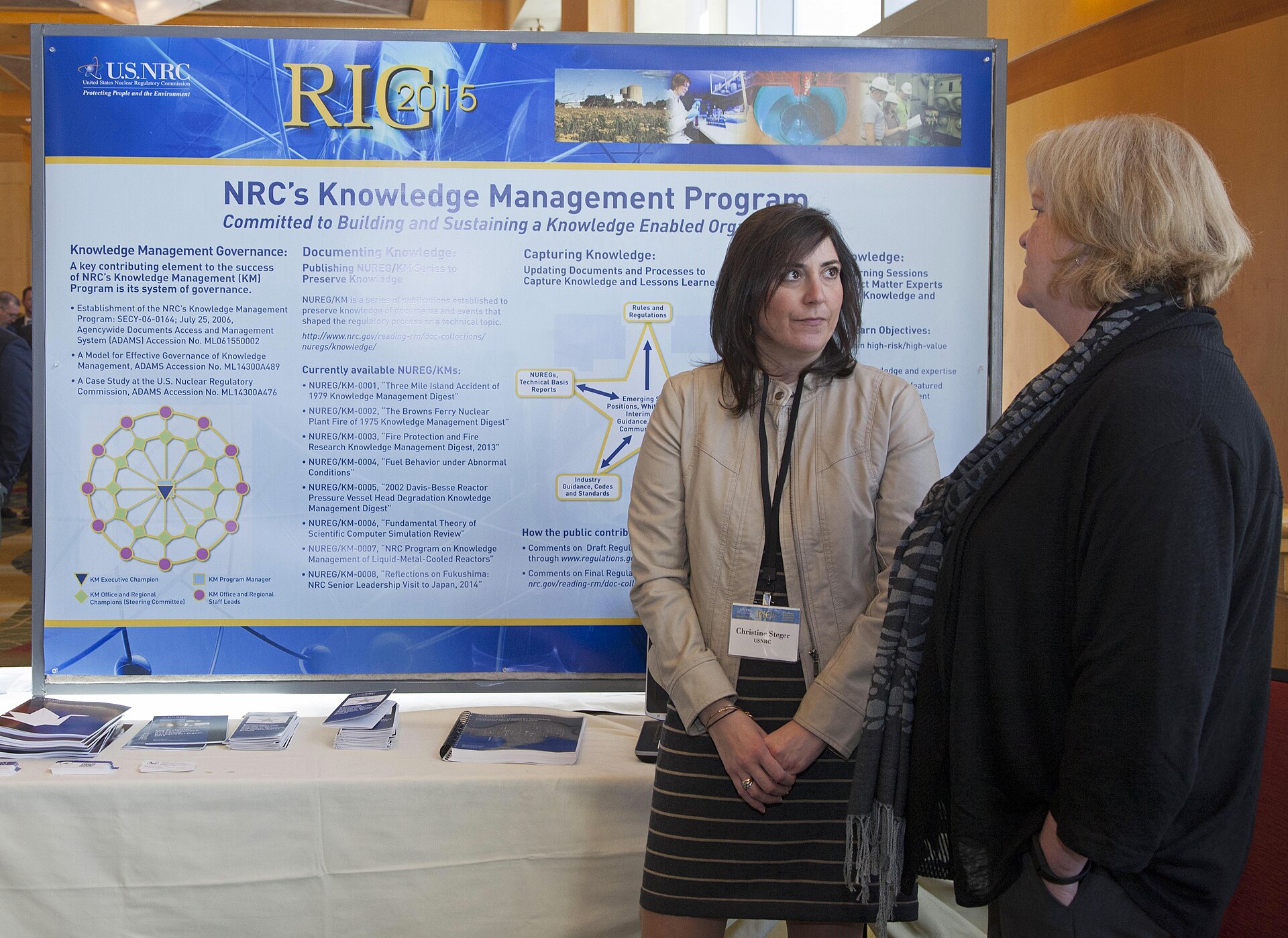
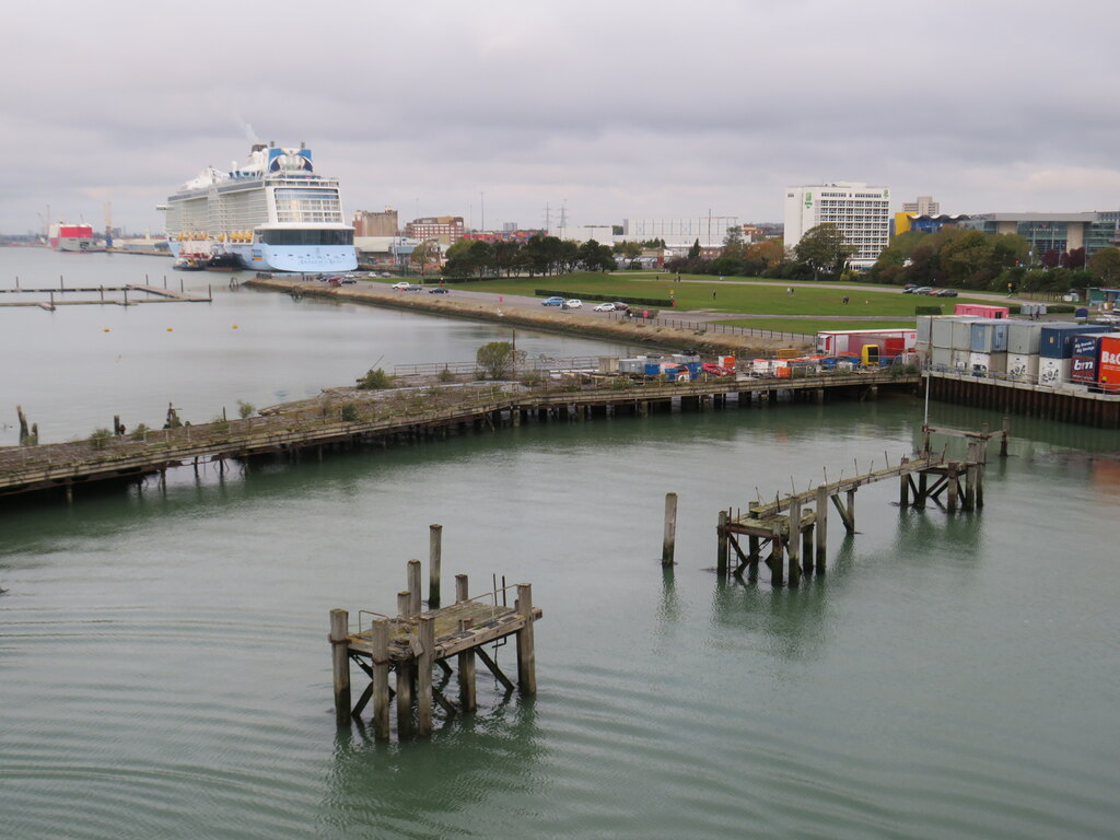
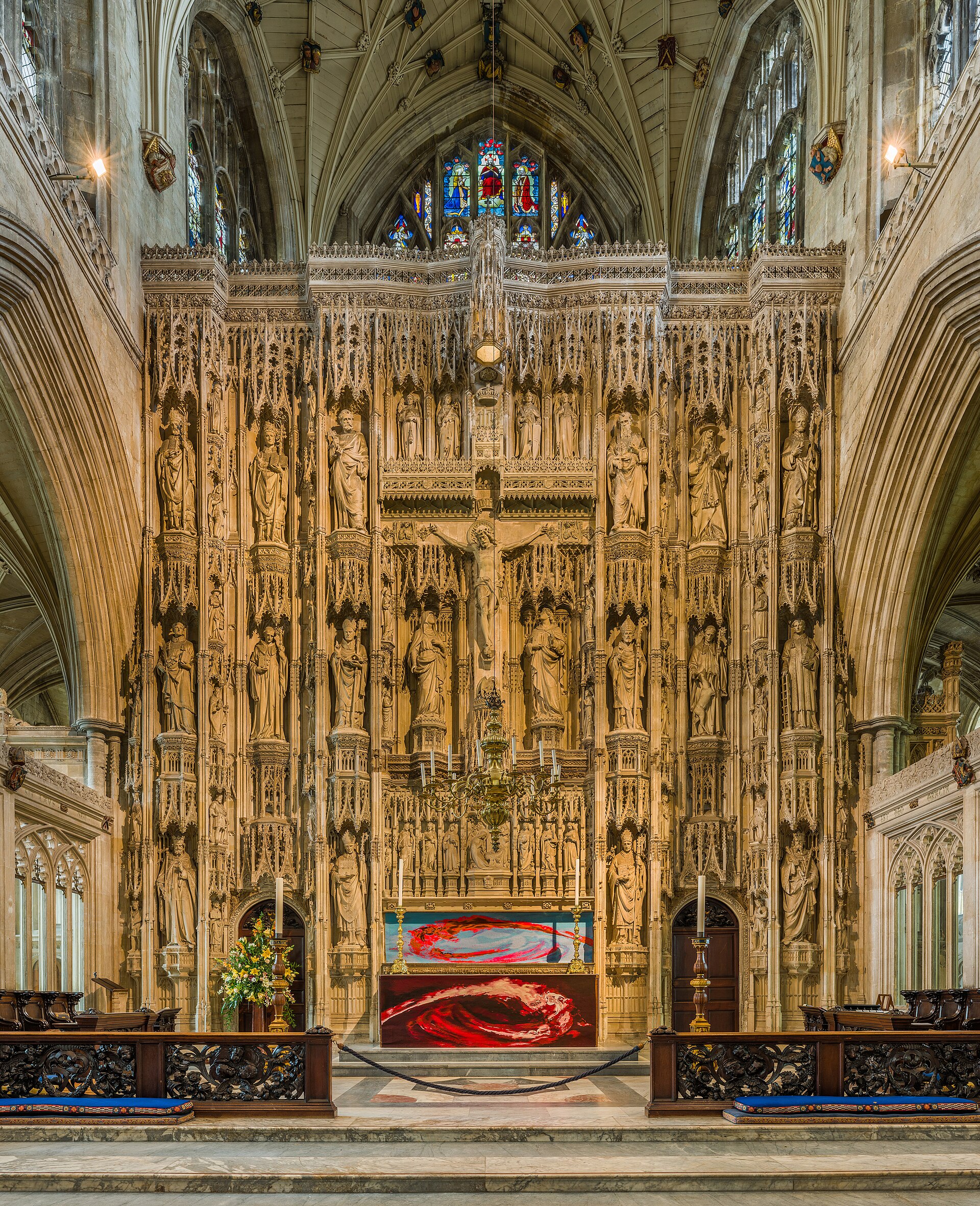 Winchester · ThuBusiness Breakfast
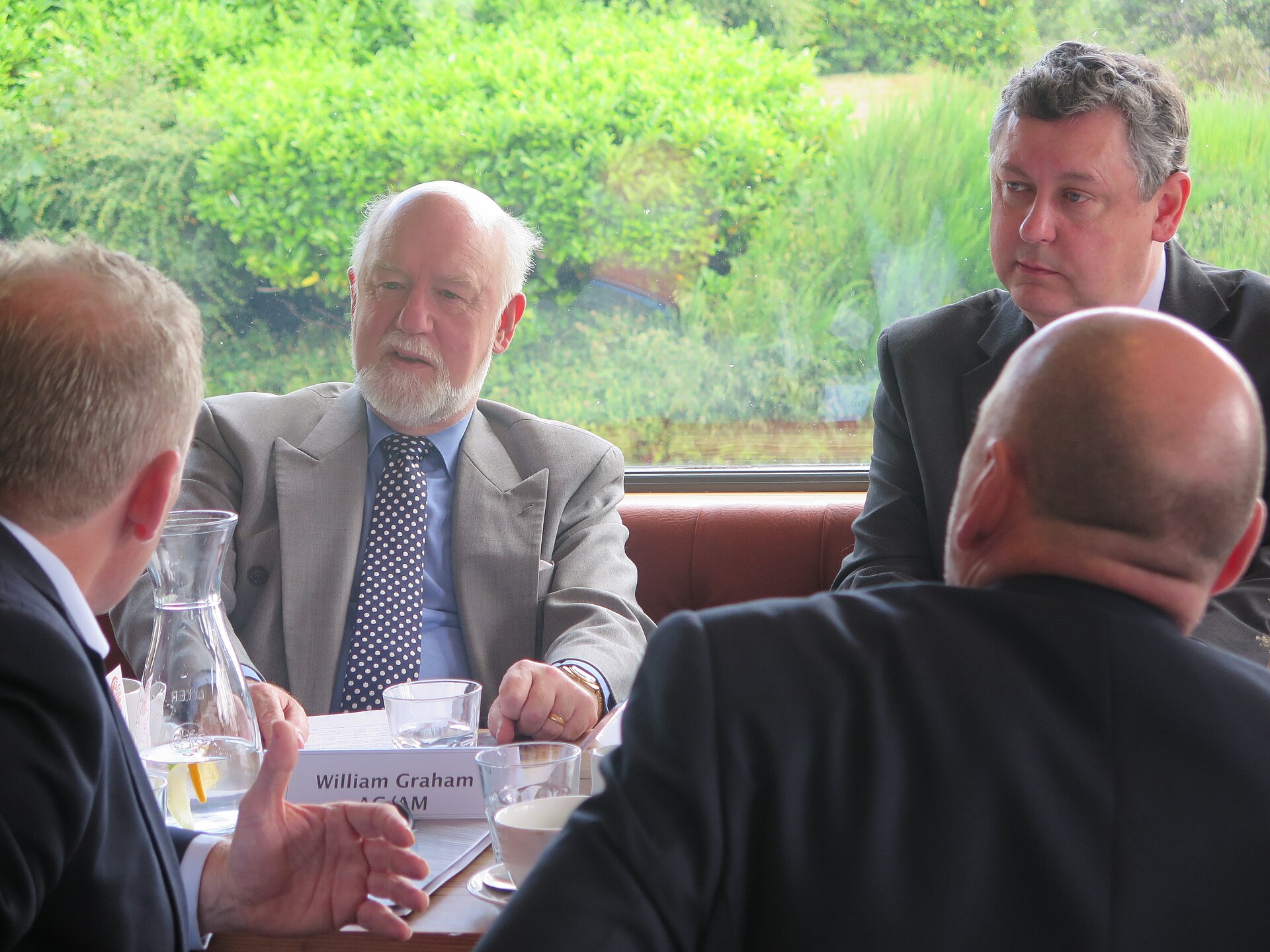 Networking25Jun
For moments that should feel like an invitation — the hero of a landing page, a call to host.
One ink surface per page — a footer, a focus mode. White headlines, muted body, the spark doing the pointing.
Live tonight
The spark marks what’s happening now.
Focus
Calm ground for late planning.
Contrast
The colour glows brighter on ink.
Emerald pills for the primary action
Lime fills for big buttons — it’s a spark, not a base
One lime accent per view (today / live)
Lime everywhere until nothing stands out
Plus Jakarta for display, Inter for reading
A display face in long paragraphs
White paper as the ground
Heavy grey panels and hard drop-shadows
Round everything to soft pills & cards
Sharp 2px corners and boxy chrome
The whole brand in a few variables. Copy it into any project — or hand DESIGN.md to an agent.
:root {
  --color-emerald-500: #1a1a1a;  /* primary */
  --color-lime-400:    #737373;  /* accent / today */
  --color-ink-950:     #0b1f17;  /* text + dark */
  --paper:             #ffffff;
  --font-display: 'Plus Jakarta Sans';
  --font-body:    'Inter';
  --font-mono:    'JetBrains Mono';
  --radius-card: 1.5rem;  --radius-pill: 999px;
  --gradient: linear-gradient(135deg,#1a1a1a,#3f3f3f,#737373);
}